Tag Archives: contemporary art

Dearly Departing

Over the past few months I’ve begun to enter the next phase of my journey.  For more than a decade I’ve been living with my elderly mother.  For much of that time I did would I could to help her adapt to her progressive dementia.  In early July it was finally time for to move to a care home.

She is happier there.  With more people around and more to do, she keeps herself active and is almost always smiling.  After spending so much time with her I do not see her demented state like most do . . . I see someone who thinks differently.  While she cannot take care of herself like “normal” people, there are times where she is fully aware of life around her.  At those times she clearly taught by example . . . our ability to give and receive love . . . so precious and so often with a smile or a laugh or two.

So now I am much more independent, and remarkably the question that comes up most often these days is, “So now Lawrence, what do you want to do?”

I have no intention of fully addressing that issue here, except to say that without a doubt I want to more with my art.  Because of my intense care giving necessities I have let a lot of art activities slide, especially on the business side of things, and to a lesser degree creatively too.

One of my major summer activities has been trying to catch up in that regard, and I’m finally getting there.  Rather than type a bunch of words on the matter, please check out the menu items on the top of this page and you will get a good feel for what I think of as “a fresh start”.

Though I am far from a young man anymore, it really does feel like I’m just starting again, and in many ways I’m grateful for that.  In that spirit, today I am launching another new creation.  It’s called “Dearly Departing” and it is shown at the top of this post.  It depicts our ability to drift into a mysterious emotional place . . . somewhat child-like, yet rather sensual . . . happy and full of love . . . temporarily escaping from life’s hardships, departing at least for awhile.


New abstract art by Lawrence Grodecki

The Energizer

In my second last post, Reflections on Light, I made a few comments on the question, “Can an infinite universe see itself?”

The comments were brief, though abstract and intriguing, at least to anyone fascinated by the subject. I mentioned the issue of time – the past, present and future. While writing those words, something in the back of my mind was telling me there’s more to this . . . more of a “Hmm” moment than an “Aha!” one.

I have to admit though, there is certainly a “Wow” factor to imagining the entire universe “seeing itself” in the moment. For me it’s simply something fun thing to think/ meditate about. On the thinking side, I begin with the assumption that the universe can perceive every moment everywhere . . . that seems to go hand-in-hand with the belief that truth exists.

Anyway, there I was, dwelling on the aspect of a view of the universe in the moment . . . as a still picture. Since then it’s occurred to me that in this universal present moment, one can “go no further”, time wise and else wise. How very odd, and wonderful!

Added to that, I got to thinking about the physical universe and the claim that it is all in motion. Any perception of that motion happens in the past – knowing or sensing that something happens only occurs after it happens.

Put those last two paragraphs together and it seems like in a way there is only the past, but this “occurring past” also blends with the present . . . in other words, in the biggest picture there really is “no future”.

Let There Be Energy!

Recently I’ve been pleasantly surprised to come across a few art experts who happen to be quite taken with the relationship between art and physics, or perhaps it is metaphysics. One of them was talking about energy and how the term originated with Socrates, who used it to describe something about work, but in the context of creativity.

But back to that absence of future, and the present watching the past – the all-seeing eye as an audience – it does make one re-think Shakespeare’s famous line, “All the world’s a stage”. The big question remains about the degree of audience participation . . . at times it certainly does seem to be there, and even in some of those still pictures? I’ll definitely be taking another look at Dali’s “The Persistence of Memory” again. I may also have to go back and re-discover what Einstein meant when he wrote about something “spooky” out there.

In the meantime, I’m tentatively calling this picture, “Who’s Your Partner?” The top picture has been resting for quite awhile – it’s called, “Dipping”!

Abstract art by Lawrence Grodecki

Who’s Your Partner?


Waving in the Mirror

In my last post, “Reflections on Light”, I mentioned that soon I’d be doing a sort of experiment with light boxes . . . trying different things with a raised mirror in a black box that I can fit over my scanner, and then try different scanning effects. I’m most intrigued by what happens when the light from the scanner goes up to the mirror and then reflects back to the scanner.

I didn’t think it would happen so soon, but I began my trial and error adventure yesterday. As luck or fate would have it, two days ago I found just the right beginner box! In what has become a monthly tradition, a couple of days ago I visited one of my favorite thrift shops. I do that when I drop my mother off for her haircut. While the shop is on the other side of the city, it’s only a few minutes from her hairdresser’s place. That gives me a solid, just-right half hour to browse. I often pick a little surprise, a treat, such as an art book or a movie. Yesterday I found a black wooden box, about 10 inches square (25 cm) on the open end, and just under 5 inches deep (12 cm). The bottom has a mirror in it, so when I rest the open end on my scanner . . . voila, my own little light box!

So $5 and a day later I began to play. I had to add a little duct tape to two ends to get a snug fit, enough to block out outside light during the scanning. Then I scanned a few objects, such as three twigs from my twig-loaded excuse of a yard. After trying a couple of other things, I felt a little disappointed . . . frankly the results have been mixed at best, but I’ve learned long ago what can become of an “ugly duckling” when it comes to this aspect of what I do. So basically right now I’m very optimistic!

Next I went back to my original curiosity, “What if I just scan the light from the scanner . . . the saved image would simply be of the scanning light, reflected back from the mirror.”

The results are intriguing. Here is that original scan, slightly cleaned up because of a few unavoidable specks of dust . . . by the way, I use a very basic 3-in-1 printer for my scanning . . . 300 dots per inch. It’s about as basic as one can get.

I’m much more used to extremely high quality scans, ones taken with a $500,000 Scitex system. That was back in my days of working with a wonderful graphic arts studio . . . my gardening catalog days. There’s no way Marvin and his crew would ever let me try this kind of stuff on that equipment . . . I have no idea whether the mirror will screw up the printer, but it’s not a big issue given the upside, creatively.

Anyways, here is a look at that image – the scanned light – it’s been enhanced to 500 dpi, though you only see it on here at 72 dpi.

Art project by Lawrence Grodecki

The first thing that struck me is the amount of color in there, in soft pastel shades. More on that in a bit . . . the other thing I’ve noticed is that the banding (vertical lines) are not exactly straight. I haven’t thought through the reason for this banding, but that can wait.

Instead, I just had to play with these colors, bring them out more, try a few effects. It started off well, though I had in mind that this would be only the start of a project that would months in the making. Most of my art takes anywhere from 30 to well over 100 hours, often spread over a period of 5 to 10 years. The difference is really in the amount of down-by-hand drawing and painting. In this project there is very little of that . . . these images below were created by using various reshaping and coloring tools . . . all really very basic, and time-intensive.

Now I”m going to show you a small series of intermediate renditions – for now I have 23 overall, but I’ve picked 6 for this post – here they are chronologically:

Art Project by Lawrence Grodecki

Art Project by Lawrence Grodecki

Art Project by Lawrence Grodecki

Art Project by Lawrence Grodecki

Art Project by Lawrence Grodecki

Art Project by Lawrence Grodecki

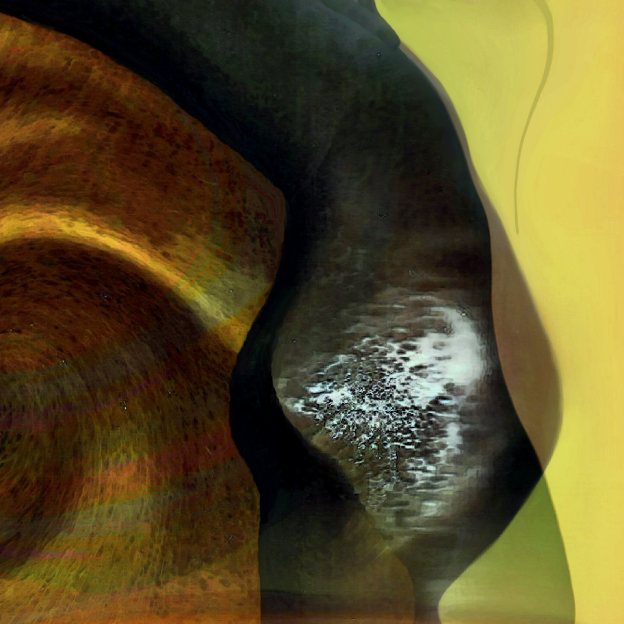
Now this next image is what I consider a finished work or art, and a prized one at that, at least for me. I don’t say that out of arrogance, but out of a real belief that if one doesn’t see one’s own work as special or even precious, than how can that person expect others to see it that way? For me it’s a nice motto to live by.

So here it is, untitled for now. It’s odd how it came out in such relevance to that other post, Reflections on Light. There is what appears to be a window, but also a frame, which is very much like the part of the photograph at the bottom of that previous post. And the story in this picture below is very much a visual display of my musings in that other post. Keep in mind, all I intended to do is see how light reflects from a mirror to a scanner . . . and then doing some art without intent:

Art Project by Lawrence Grodecki

Finally, it’s been a real pleasure doing a presentation-like post. Most of my art doesn’t lend itself to this kind of story-telling. As I mentioned before, most of my art is spread over several years and so many more hours, so documenting all of it like this is more than a little too much.

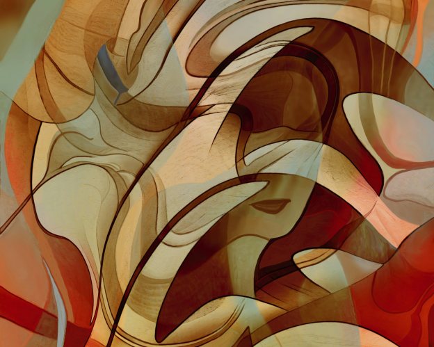
And I almost forgot, the feature image at the top, the bright abstract piece . . . that too is from this same first image of a scan of light.


Wonder Together - new art by Lawrence Grodecki - available on SaatchiArt

A Belly Full of It

Art blogging isn’t coming easily these days. It’s not a matter of writer’s block, if anything it’s the opposite. However, the things I ponder upon are far from what most people care to think about . . . esoteric things like pure mathematics, a conundrum in the measurement of equilateral triangles, and how that relates to circles . . . concepts like that.

You may find it odd, but for me these topics are ultimately inseparable from the issue of a whole other dimension to life. The invisible . . . the imaginary, yet so very real . . . capable of magic? In my experience – and not just with art –  I have to answer “Yes.” And I know I’m not alone.

Carl Jung described an artist as being one who carries and shapes the unconscious, psychic life of mankind. His views on the subconscious and how that can relate to art is eerily familiar. He makes it sound so bleak though. Perhaps that is because he seemed so serious about it all . . . his collective thoughts on the human psyche. While it does involve a lot of solitude, for me it has been an amazing journey, full of surprises, too many to describe. And at times it does feel timeless, another pet subject of mine . . . so much to think about.

What I see that is common in my art ties into the issues above. I can and do tie it together with one simple statement, “There are no lines in nature.”

If there is anything special in any of my art, I truly believe it has something to do with that deceptively simple observation.

It’s funny how that ties in to something that happened over thirty years ago. I was getting my first degree (in psychology) and took a course in religion as one of my electives. I had just finished a paper on Inuit culture, especially the spiritual aspects. Somehow, within this paper I had drawn a pair of parallel lines . . . even used a ruler! While photocopying this paper I must have accidentally enlarged it. When I looked at these lines they were no longer “straight”; they had all kinds of bumps or waves – little curves – and that’s when it first occurred to me that perhaps parallel lines don’t really exist. Can that be true? If so, then some day I would have to prove it.

About fifteen years ago I began thinking about this once more, and a few years later the proof came, while examining circles and playing with Pi. I use the term “proof” loosely, as ultimately there are no numbers involved . . . only logic, pictures and perhaps a little imagination? More self-teaching? That’s such a fuzzy term!

Rather than writing about, I much prefer discussing my art, with those who sense something special about it, whether that is with a collector, a fan, or a curator. I’ve found those discussions so much more enriching than simply writing about my art, be it a blog post or the description of a painting. It really is a joy and a treat of sorts, the person-to-person dialogue.

As for all that math, I wonder where we’d all be now if we had evolved with seven fingers instead of 10! And would the art be the same? Would the elephant still be so picky about her belly in doing a self-portrait?

art by Lawrence Grodecki

In-Title Mints

Storytelling. I miss that, sometimes. I do a lot of thinking, and often I’ll catch myself in the middle of a story I’m telling, in my mind. Ever since writing a novel,  there has been this urge to make my next writing project a series of short stories.

One of the most enjoyable aspects of writing the novel came at the end. That’s when I actually named the chapters. It came as a total surprise how much fun that can be, adding a little dimension of mystery, with clues hidden in the titles. However, the title of the book was a different matter. I actually published it under two different titles and anguished over dozens of others . . . I’m still not totally happy with the current one.

I mention all this because it is very much like the process of titles with my artwork. It occurred to me just this morning that when a title feels really good, it’s often because there is an element of storytelling to it.

If you take one of my current projects as an example – the feature image on this post –  you can see that it is pretty abstract, yet there are also some pretty dominant figurative elements in it. If so inclined, it’s the kind of painting that can lead you down the path of a daydream, in search of stories about the characters in the picture.

And that brings me to the matter of the title; this picture is tentatively called, “Studying the Voyeur”.

In a way, perhaps that set of three words is really a story in itself? It does tie in nicely with the several ghosted images throughout the painting. Some seem intrigued. I hope so, even though they were not invited!

Wanda and Waldo

Recently I spent some quality time with a long distance friend, in a private conversation on Facebook. It was nice. She needed an escape from her current woes, and as she loves my art, I was welcome to do a little show and tell with one of my current projects. She is quite taken with my technique(s), and so occasionally I’ll take the time to indulge her curiosity.

Through the course of explaining certain things, a new painting came into being. I described it as a marriage between two separate pieces. One is a bright & colorful and over a decade old. That’s “Palms Up”, as shown below. FYI, this is originally some simple streaks of ink markers on aluminum foil. Once those streaks were scanned, they were remolded into what you see here. The other picture is from this year – “The Rub” – based on an ink sketch on paper.

art by Lawrence Grodecki

The marrying occurs when the image of one is layered on top of the other. The result of the consummation is something entirely different, yet holds a noticeable resemblance to each:

art by Lawrence Grodecki

While the initial consummation only took a few minutes, the growth of the new creation took a little time . . . it has its own stages of development.

In this case though, my creation became two distinctly different figurative compositions, though the changes are minor in the big picture. And somehow The rub became more dominant over the poor palms. Trying to decide upon one of these new pictures over the other has become a real dilemma. Luckily, as an artist I am free to show you both. However, as in the parable of the chicken and the rooster, I cannot tell you which came first!

I’ll show you both pictures shortly. It took awhile to select the right titles, especially if I wanted to maintain the mystery of this chronology. So in the spirit of ladies first, I present to you, “Finding Wanda” followed immediately on the right by “Finding Waldo”.

new art by Lawrence Grodecki

I’m thinking of adding them both to my Saatchi Art Selections, hopefully in the next  day or so. But for now, out of curiosity, would you care to guess which came first? As to which one you prefer, I’ll leave that matter alone . . . none of my business . . . and I don’t want to make any political statement on the matter.

17 on 28 or 9 Feels As Good as 31!

Every so often I’ll post a blog that’s number-related. I suppose this is one of them, though perhaps in a roundabout way?

By roundabout I mean stuff like superstition. For example, in my youth I had a favorite number for my hockey jersey. I was a goalie, and back then each of two goalies on a team would pick between the lowest jersey number and the highest one. So one goalie always wore #1 and the other would get #30 or #31.

I hated #1 . . . was forced to wear it a few years. I swear I played better as #31, my favorite.

I got thinking about my superstitions over the weekend. I had just spent almost the entire week on taking a hard look at SaatchiArt.com. By Friday I was in the process of signing on with them. While I would like to say I’m really excited about it, for now it is best to say that I’m thrilled with the opportunity the site provides . . . they are doing a lot of things right.

I had hoped to have some art up by Saturday night. That didn’t happen. I was surprised at how long it took me to decide on a body work to introduce myself on SaatchiArt.

I actually did a little research as to what constitutes a body of work, especially in the context of quantity. That was a smart move. I had been thinking of doing somewhere between 15 and 20, and in the end I decided on 17, largely because that was my suite number when I began this creative adventure almost eleven years ago.

It’s a sweet 17!

After so many hours of self-curation, I knew it was a good selection. That was confirmed when I hit the preview button for the set (on my computer, not on the site). The slide show presents in alphabetical order, and I’ll be damned – I wouldn’t change a thing! Believe me, that’s such a rare thing for me in such matters . . . a good omen? Perhaps.

Now to cap it off, sometime through Sunday evening it dawned on me that if I wait until Monday (February 29th) then my future anniversaries on the site can only happen once every four years . . . very cool!

But then something else crossed my mind.  SaatchiArt is headquartered in California, which is two hours earlier than Manitoba time. So what I did was wait until just after midnight to submit my first creation . . . basically I began on February 29th in Manitoba . . . easy peasy. However, that work of art went live right away, and in California the art was launched shortly after 10:00 at night, on February 28th!

So it appears I will get my cake and can eat it too? I can legitimately claim my first anniversary will be on February 28th and once every leap year and I get 2 celebrations!

My apologies about being so nostalgic about the future. And now I’ll leave you with one more thought – a question, “Given the above, is my art now officially timeless?” If so, who knew it would be so easy, or involve such irrational numbers?

Finally, here is one of my limited edition creations . . . it’s available through SaatchiArt.com . . . clicking the image will take you there!

New art by Lawrence Grodecki

Observing Tess

New illustrative art by Lawrence Grodecki

A Knock At the Door

Perhaps it is best not to be in a reflective mood when working on this picture, “One More Step To Heaven”? Ah, to be or not to – actually this version of the picture is saved as “3b” – maybe I skipped a step?

That elusive stairway, or is it a case? As one immersed in visual art, I’m totally biased . . . can’t help thinking of it as a “stare way”! I do believe that our imagination can take us to many such fine places . . . and there must be plenty of humor out there, right?

After all, no matter how somber St. Peter is described as the gatekeeper, still there are so many jokes about his pearly ones! Then again, one must take a leap of faith to believe that the gods have a firm grasp on the difference between good humor and bad. Think about it. As you are greeted at the gates with a big smile, the big guy points you to a door out there marked “Heaven” and away you go. St. Peter roars in laughter as he turns his back at another “Gotcha!”

Thankfully he has his eyes closed, so he didn’t see me move this deceptive door around to in front of him. He seemed to have a look of panic when he opened his eyes, finding himself now on the wrong side of the gates.

As for me, I just whistled away, floating away on a different path . . . all very odd given how I could never whistle down here! Time to go now – need to clean a cheap grill!

A Sunday Sketch

This past Sunday I did something I haven’t done in a long time; I took out a sketch pad and a gel pen and doodled for a few hours. It was refreshing, especially in the sense that I got to use my left hand for a change. Yes, I’m a southpaw, except for one major activity – the computer-design aspect of my art.

Here’s the sketch and what came of it:

Abstract figurative art by Lawrence Grodecki

The original is about 9 x 7 inches; while the images shown are 10 x 8 inches. One nice surprise is that in the scanning the texture of the paper really came through. I don’t have a high quality scanner, and the paper and pens are used are far from the best quality. The result is the bluish tinge that brings out that “watercolor paper” texture in the background. You can see that clearly at actual size.

One thing that I’d almost forgotten is how much faster it is to draw on paper, at least for me. The paper sketch took maybe three hours at the most . . . I call it doodling because when I do this kind of thing I’m trying not to think as I draw.

I wanted to start in the middle, and the first stroke of ink is the smallest curve almost in the middle of the picture. After that I just “worked around” that first curve. I have no idea what the second or the last curves were! At this stage of a project I’ve become pretty good at catching myself in time . . . the over-thinking . . . and that’s when I’ll stop for a short while. It doesn’t take long to know when to begin again.

By contrast, the on-screen rendition on the right took much longer to complete. The version I’m showing above actually took about 12 hours, more or less . . . probably more. This process also entails more thinking, but to be honest, one can easily get lost in the doing of it, much as in the paper sketch . . . the same but different! 🙂

More of the “but different”

Finally, while I like the sketches, typically I can’t wait to add some color . . . and so the adventure continues.

I’m showing you the result in the final art, below. When it was done I stepped back, looking at differently than I do while engaged in the creation of it. That’s a nice phase of most of my art . . . almost like seeing it as an outsider would? ha ha

Anyways, that’s when I noticed the cloudy kind of aspect. That immediately reminded me of Joni Mitchell’s iconic art for the album “So Far”, partly because of a similarity in style, but also because of her rendition of “Both Sides Now”. Since taking up my art full-time, I’ve spent a lot of time enjoying the clouds. And as much as I love the song, I’m always puzzled by the notion of “both sides” . . . I can’t even begin to imagine how many sides there are to clouds . . . certainly too many to count, and more than two.

Still, in the end – in coming up with a title for this work of art, I’ve decided on, “More Sides Now”. I think I’ve said enough now . . . time to hear what you think . . . care to comment?

"More Sides Now" by Lawrence Grodecki

“More Sides Now” by Lawrence Grodecki


New digital art by Lawrence Grodecki

The Artist Released

If you’ve seen my last 2 blog posts then you will recognize this picture. It’s in its finished form now . . . I’ve done some fine-tuning of the figurative aspect, changed the dimensions slightly, and added some texture, not to mention the colors and other light concerns . . . so basically a day and a bit of tweaking!

I’m really pleased how it turned out . . . the curves, the blending of images . . . the layers . . . the playful depiction of this artist’s mind! While I’ve never seriously considered doing a self-portrait, now I see no need to do so . . . this is close enough for jazz!