Author Archives: Lawrence Grodecki

About Lawrence Grodecki

I'm a visual artist with a contemporary look. My art is not so easily classified and some have told me I'm developing a new style... "Lawrence`s unique choice of combining his drawing, natural found objects and digital painting represent an evolved and mature art language." - Laara Williamsen

Wanda and Waldo

Recently I spent some quality time with a long distance friend, in a private conversation on Facebook. It was nice. She needed an escape from her current woes, and as she loves my art, I was welcome to do a little show and tell with one of my current projects. She is quite taken with my technique(s), and so occasionally I’ll take the time to indulge her curiosity.

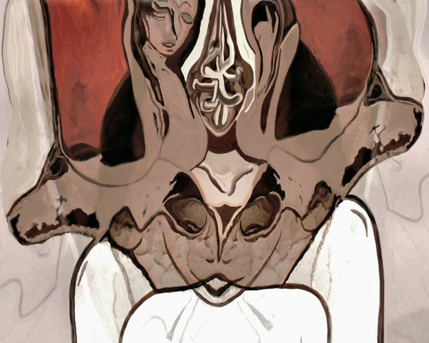
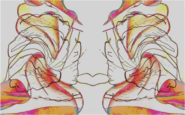
Through the course of explaining certain things, a new painting came into being. I described it as a marriage between two separate pieces. One is a bright & colorful and over a decade old. That’s “Palms Up”, as shown below. FYI, this is originally some simple streaks of ink markers on aluminum foil. Once those streaks were scanned, they were remolded into what you see here. The other picture is from this year – “The Rub” – based on an ink sketch on paper.

art by Lawrence Grodecki

The marrying occurs when the image of one is layered on top of the other. The result of the consummation is something entirely different, yet holds a noticeable resemblance to each:

art by Lawrence Grodecki

While the initial consummation only took a few minutes, the growth of the new creation took a little time . . . it has its own stages of development.

In this case though, my creation became two distinctly different figurative compositions, though the changes are minor in the big picture. And somehow The rub became more dominant over the poor palms. Trying to decide upon one of these new pictures over the other has become a real dilemma. Luckily, as an artist I am free to show you both. However, as in the parable of the chicken and the rooster, I cannot tell you which came first!

I’ll show you both pictures shortly. It took awhile to select the right titles, especially if I wanted to maintain the mystery of this chronology. So in the spirit of ladies first, I present to you, “Finding Wanda” followed immediately on the right by “Finding Waldo”.

new art by Lawrence Grodecki

I’m thinking of adding them both to my Saatchi Art Selections, hopefully in the next  day or so. But for now, out of curiosity, would you care to guess which came first? As to which one you prefer, I’ll leave that matter alone . . . none of my business . . . and I don’t want to make any political statement on the matter.

17 on 28 or 9 Feels As Good as 31!

Every so often I’ll post a blog that’s number-related. I suppose this is one of them, though perhaps in a roundabout way?

By roundabout I mean stuff like superstition. For example, in my youth I had a favorite number for my hockey jersey. I was a goalie, and back then each of two goalies on a team would pick between the lowest jersey number and the highest one. So one goalie always wore #1 and the other would get #30 or #31.

I hated #1 . . . was forced to wear it a few years. I swear I played better as #31, my favorite.

I got thinking about my superstitions over the weekend. I had just spent almost the entire week on taking a hard look at SaatchiArt.com. By Friday I was in the process of signing on with them. While I would like to say I’m really excited about it, for now it is best to say that I’m thrilled with the opportunity the site provides . . . they are doing a lot of things right.

I had hoped to have some art up by Saturday night. That didn’t happen. I was surprised at how long it took me to decide on a body work to introduce myself on SaatchiArt.

I actually did a little research as to what constitutes a body of work, especially in the context of quantity. That was a smart move. I had been thinking of doing somewhere between 15 and 20, and in the end I decided on 17, largely because that was my suite number when I began this creative adventure almost eleven years ago.

It’s a sweet 17!

After so many hours of self-curation, I knew it was a good selection. That was confirmed when I hit the preview button for the set (on my computer, not on the site). The slide show presents in alphabetical order, and I’ll be damned – I wouldn’t change a thing! Believe me, that’s such a rare thing for me in such matters . . . a good omen? Perhaps.

Now to cap it off, sometime through Sunday evening it dawned on me that if I wait until Monday (February 29th) then my future anniversaries on the site can only happen once every four years . . . very cool!

But then something else crossed my mind.  SaatchiArt is headquartered in California, which is two hours earlier than Manitoba time. So what I did was wait until just after midnight to submit my first creation . . . basically I began on February 29th in Manitoba . . . easy peasy. However, that work of art went live right away, and in California the art was launched shortly after 10:00 at night, on February 28th!

So it appears I will get my cake and can eat it too? I can legitimately claim my first anniversary will be on February 28th and once every leap year and I get 2 celebrations!

My apologies about being so nostalgic about the future. And now I’ll leave you with one more thought – a question, “Given the above, is my art now officially timeless?” If so, who knew it would be so easy, or involve such irrational numbers?

Finally, here is one of my limited edition creations . . . it’s available through SaatchiArt.com . . . clicking the image will take you there!

New art by Lawrence Grodecki

Observing Tess

New illustrative art by Lawrence Grodecki

A Knock At the Door

Perhaps it is best not to be in a reflective mood when working on this picture, “One More Step To Heaven”? Ah, to be or not to – actually this version of the picture is saved as “3b” – maybe I skipped a step?

That elusive stairway, or is it a case? As one immersed in visual art, I’m totally biased . . . can’t help thinking of it as a “stare way”! I do believe that our imagination can take us to many such fine places . . . and there must be plenty of humor out there, right?

After all, no matter how somber St. Peter is described as the gatekeeper, still there are so many jokes about his pearly ones! Then again, one must take a leap of faith to believe that the gods have a firm grasp on the difference between good humor and bad. Think about it. As you are greeted at the gates with a big smile, the big guy points you to a door out there marked “Heaven” and away you go. St. Peter roars in laughter as he turns his back at another “Gotcha!”

Thankfully he has his eyes closed, so he didn’t see me move this deceptive door around to in front of him. He seemed to have a look of panic when he opened his eyes, finding himself now on the wrong side of the gates.

As for me, I just whistled away, floating away on a different path . . . all very odd given how I could never whistle down here! Time to go now – need to clean a cheap grill!

A Sunday Sketch

This past Sunday I did something I haven’t done in a long time; I took out a sketch pad and a gel pen and doodled for a few hours. It was refreshing, especially in the sense that I got to use my left hand for a change. Yes, I’m a southpaw, except for one major activity – the computer-design aspect of my art.

Here’s the sketch and what came of it:

Abstract figurative art by Lawrence Grodecki

The original is about 9 x 7 inches; while the images shown are 10 x 8 inches. One nice surprise is that in the scanning the texture of the paper really came through. I don’t have a high quality scanner, and the paper and pens are used are far from the best quality. The result is the bluish tinge that brings out that “watercolor paper” texture in the background. You can see that clearly at actual size.

One thing that I’d almost forgotten is how much faster it is to draw on paper, at least for me. The paper sketch took maybe three hours at the most . . . I call it doodling because when I do this kind of thing I’m trying not to think as I draw.

I wanted to start in the middle, and the first stroke of ink is the smallest curve almost in the middle of the picture. After that I just “worked around” that first curve. I have no idea what the second or the last curves were! At this stage of a project I’ve become pretty good at catching myself in time . . . the over-thinking . . . and that’s when I’ll stop for a short while. It doesn’t take long to know when to begin again.

By contrast, the on-screen rendition on the right took much longer to complete. The version I’m showing above actually took about 12 hours, more or less . . . probably more. This process also entails more thinking, but to be honest, one can easily get lost in the doing of it, much as in the paper sketch . . . the same but different! 🙂

More of the “but different”

Finally, while I like the sketches, typically I can’t wait to add some color . . . and so the adventure continues.

I’m showing you the result in the final art, below. When it was done I stepped back, looking at differently than I do while engaged in the creation of it. That’s a nice phase of most of my art . . . almost like seeing it as an outsider would? ha ha

Anyways, that’s when I noticed the cloudy kind of aspect. That immediately reminded me of Joni Mitchell’s iconic art for the album “So Far”, partly because of a similarity in style, but also because of her rendition of “Both Sides Now”. Since taking up my art full-time, I’ve spent a lot of time enjoying the clouds. And as much as I love the song, I’m always puzzled by the notion of “both sides” . . . I can’t even begin to imagine how many sides there are to clouds . . . certainly too many to count, and more than two.

Still, in the end – in coming up with a title for this work of art, I’ve decided on, “More Sides Now”. I think I’ve said enough now . . . time to hear what you think . . . care to comment?

"More Sides Now" by Lawrence Grodecki

“More Sides Now” by Lawrence Grodecki


New digital art by Lawrence Grodecki

The Artist Released

If you’ve seen my last 2 blog posts then you will recognize this picture. It’s in its finished form now . . . I’ve done some fine-tuning of the figurative aspect, changed the dimensions slightly, and added some texture, not to mention the colors and other light concerns . . . so basically a day and a bit of tweaking!

I’m really pleased how it turned out . . . the curves, the blending of images . . . the layers . . . the playful depiction of this artist’s mind! While I’ve never seriously considered doing a self-portrait, now I see no need to do so . . . this is close enough for jazz!


Artist at Work

I’m quite enjoying keeping my posts short lately. Maybe that’s because this project is turning out to be much bigger than I thought it’d be . . . I’m reviewing pretty much all my art in search of the truly abstract . . . in other words, no figurative elements.

In the process I’m stopping occasionally, drawn to a certain picture – often long-forgotten – and I’ll begin playing with it, though in a way it is my work as well. The presence of the end of a felt marker at the top center is what led me to this so-very-appropriate title, “Artist at Work”. No matter how you view this piece, flipped, sideways, and so on, you will always see the artist at work.

So here it is . . . “Artist at Work”:

Abstract figurative art by Lawrence Grodecki

Artist at Work

A piece of ice.

I figured, it was ice!

This first image is not what I consider a work of art, though it does seem intriguing. Perhaps that’s because it’s actually a piece of ice that I picked from my front yard? I scanned it immediately, and while this image has been mildly modified, this is essentially that chunk of ice.

I often refer to an image like this as my blank canvas, as it really is the starting point of a few of my creations, including this most recent one, as shown here:

abstract figurative art by Lawrence Grodecki

Even though it’s not quite complete, I would have liked to consider this as part of an entry in an upcoming abstract art competition. However, I’d say there are far too many figurative aspects, especially when you look at the details . . . you really do need a laptop-size monitor to really see that aspect.

I’m finding it difficult to find many of my creations that are purely abstract. Thankfully, for years now I describe my style as being abstract-figurative, and if you’ve seen a dozen or more of my pieces, I’m sure you would agree.

I have a few weeks to submit my entry. It’s a juried competition and given the past winners, it would be quite an honor to be among the top ten. I’m planning on posting 3 – 5 of my selections in a blog post before entering. I’ll also be adding a little “what’s your favorite?” kind of survey . . . one or two simple questions . . . that should be fun!

Finally, I’m adding this favorite music video. It goes so well with the process of this painting. 🙂

new art by Lawrence Grodecki

New, Untitled Art

As promised, I said I’d post an update on the project I described in my most recent post – When Projects Kaleid. The feature image here is that update. While I do consider this to now be a finished piece, I’m still playing with different renditions. This could be one of those pictures where a handful of renditions are more than acceptable, yet notably different.

For now the piece remains untitled, and no, “Collie Eyed” is not under serious consideration!

PS – Here is an afternoon addition to this original post. I wanted to show what I mean by a “notably different” rendition . . . very acceptable, I think.

hmm1b2_3x4b2b_Fix2b2b6b2_Crop3b2b2_sm

Charlie’s A Rose

I’ve intended to write something about my art in the context of feminism for a long time now. This is not easy because I know very little about what the term even means, aside from the desire to have equality between men and women in our culture.

The press gives a lot of attention to women being paid 30% less than men for the same work. When I talk to women about this there is a lot of frustration, resentment, and so on. However, inevitably the discussion comes to a silent end when I point out that one solution is for all those men to take a 30% pay cut. Often there is a look of horror, as I can see some of these women calculating the impact that would have on them, given their husband’s salary . . . but the issue of a culture of “wanting more” is a whole other topic, except to say that the aspect appears to be truly “gender neutral?

In reflecting back, I’m very happy to see how wonderfully balanced the years were, at least in terms of my time spent with both men and women . . . to explain that more fully means adding tons of stories . . . that’s for a book, not a blog. The truth is that on some subconscious level I’ve always put women (as a group) on a pedestal – somehow at least slightly superior to men – perhaps the real source of hope for a better future?

I no longer feel that way as women become more like men overall. For example, I see no reason to celebrate the so-called gender equality in some countries’ militarization. And with so many big issues confronting humanity, are any discrepancies between the sexes at the root of it all? I really have no idea, not even sure if it’s the right question, not sure if the “root” itself is even an issue today.

Back To the Art

How does this relate to my art? Well if you’ve taken any time to view much of it, overall there is a major emphasis on the feminine form. Very often it comes up in one-on-one discussions, except when I get that a sense that the whole issue of the sensuality of my art can be too much for someone to talk about. That happens often too. That can be a little depressing for me, as I know that there are some who look at my art and somehow come to a conclusion that the “artist must be some kind of sexist” . . . I’m not sure there is another more troubling accusation . . . but I make no apologies for anything about my art.

The truth is I do it all with no intent, though I suppose that needs to be qualified. Years ago, when I noticed how “biased” toward the feminine my art was becoming, I tried to counter that by consciously introducing more masculine forms into this or that piece. It felt forced. With a little work I could have attained more of that kind of balance, but I chose not to . . . that’s not the kind of force I want to be with me!

My art is what it is. As for the male/ female issues, while I believe in equality in principle, I also cherish the differences. Frankly though, I’d much rather just continue to paint rather to analyze this situation . . . that part is reserved for my writing, and was central to my first novel . . . so much fun in fiction . . . or was it really fiction? hmmm

Some Help From the Missing Links

Finally, I’d like to share a couple of links with you here. The first is an interview with Gloria Steinem on Charlie Rose. She says some stuff better than I do, and I was quite taken about her comments on some of the ancient cultures, ones that had no words for “female” or “male”. They also seemed to appreciate the significance of circles, as opposed to hierarchies (pyramids). This topic that has been a huge passion of mine . . . oddly that started when I began my transition into a person immersed in the creation of art.

The second link shows some music and dancing by people with a Kwayan African background. This ancient culture is one of the two that Gloria notes as being “gender neutral”. It’s a little surreal at times, especially with the shots of the guy on the organ wearing the socks. But let me rephrase that . . . the person playing the organ . . . big foot? ha ha